Aqua vs elementary OS
アクア / elementary OS
Aqua comes from Apple UI and elementary OS from Platform Screen Languages. They are reached for with some of the same intent, which is where they get confused.
Aqua


Mac OS X's design language of buttons you want to lick. Jelly gloss, pinstripes, deep shadows and the genie effect staged digital components as objects you could touch, and set the terms for UI throughout the 2000s. What the web made of it with images is Web 2.0 Gloss.
elementary OS
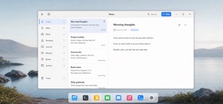
elementary OS builds a consistently beautiful, immediately understandable desktop from concise language, single-purpose windows, distinctive app icons and restrained depth.
| Aqua | elementary OS | |
|---|---|---|
| Era | 2000–2014 | 2011– |
| Family | Apple UI | Platform Screen Languages |
| Kind | Style | Style |
| Cues | Gel-gloss buttons / Pinstriped grounds / Deep drop shadows / Metaphors of water and light | A few primary actions in the top toolbar / Short copy built from concrete verbs / Multicolor app icons with distinctive silhouettes and a dark one-pixel outline / White work surfaces, pale chrome and blue suggested actions |
| Best used for | Recreating 2000s digital culture with the texture it actually had · Making what is clickable read at once as a pressable object | Small single-purpose Linux desktop applications · Desktop interfaces whose result must be clear without technical language |
| Type | No shadow on text, weighted to stay legible over gloss | Use brief everyday language and explicit verbs; never label an action merely OK. |
| Composition | Components evenly spaced, gaps left for shadows to fall into | Give one window one subject, primary actions at the top, content in the center and secondary detail on demand. |
| Material | A hard white highlight above, reflection and deep shadow below | Build from white and pale gray, fine shadows and blue suggested actions; give icons unique silhouettes and a dark one-pixel edge. |
| Caution | Gloss and shadow applied evenly to every component hides what is actually pressable, leaving texture where hierarchy should be. | macOS-like wallpaper and rounded icons miss the point. The concise writing and one-window-one-purpose model must travel with the look. |