AfriCOBRA vs Casablanca Art School
アフリコブラ / カサブランカ美術学校
AfriCOBRA comes from Black Arts Movement and Casablanca Art School from Modern and Contemporary Art Movements. They are reached for with some of the same intent, which is where they get confused.
AfriCOBRA


Visualizes Black communal affirmation and political consciousness through blazing color, rhythm, lettering and Africa-centered images.
Casablanca Art School
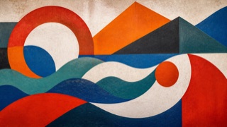
In post-independence Morocco, the Casablanca Art School challenged colonial art education by connecting abstraction to Amazigh rugs, jewelry, calligraphy and painted ceilings, then carrying the same language beyond framed painting into posters, magazines, street exhibitions and murals.
| AfriCOBRA | Casablanca Art School | |
|---|---|---|
| Era | 1968– | 1962–1970s |
| Family | Black Arts Movement | Modern and Contemporary Art Movements |
| Kind | Style | Style |
| Cues | Kool-Aid colors / Rhythmic repetition / Letters and figures / Afrocentric imagery | Geometric and organic abstraction built from flat color and contour / Repetition and symmetry learned from Amazigh rugs, jewelry and signs / Strong red, orange, blue and green on earth color or white / One language crossing painting, poster, magazine and outdoor mural |
| Best used for | Posters for Black community events and music where color and rhythm are the subject. · Affirming words built into the image and printed to be carried and held up. | Opening a cultural or educational program from gallery into poster, publication and street through one language · Translating regional craft into principles of modern color and repetition instead of pasting it on as ornament |
| Type | Bend the words along the figures so the slogan becomes structure, not caption. | Set short headings in a clear sans and treat Arabic and Latin scripts as equal compositional units. |
| Composition | Repeat one shape at even intervals so the eye keeps circling the surface. | Divide large fields into waves, chevrons, circles and bands that continue to the edge of page or wall. Avoid small framed-picture enclosures. |
| Material | Set near fluorescent saturated colors side by side, holding print flatness. | Use matte pigment, wood, leather, textile and print according to their medium, documenting craft source and maker. |
| Caution | Copying only the intensity of color while dropping the community's words and faces stylizes the look and loses the purpose, which was affirmation. | This was not Moroccan pattern pasted behind Western modern art. Treat education, public space, publishing and the revaluation of craft as part of its decolonial practice. |