Adobe Spectrum vs GitHub Primer
Adobe Spectrum / GitHub Primer
Both sit in Platform Screen Languages, so the question is not what they belong to but how they behave. They are reached for with some of the same intent, which is where they get confused.
Adobe Spectrum
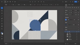
Adobe's cross-application design system. Under the principles Rational, Human and Focused, it changes density between desktop and mobile while keeping tool-heavy interfaces from pulling attention away from the work itself.
GitHub Primer


GitHub's design system for turning dense development workflows into shared rules for color, type, icons, spacing and components. It favors flow over decoration, keeping many states and actions in a small area without giving up accessibility or responsive behavior.
| Adobe Spectrum | GitHub Primer | |
|---|---|---|
| Era | 2013– | 2017– |
| Family | Platform Screen Languages | Platform Screen Languages |
| Kind | Style | Style |
| Cues | Neutral surfaces with vivid color reserved for selection / Icons, type and borders scaling together / Toolbars and property panels joined by fine divisions / The creative work stays stronger than the interface | Neutral surfaces with blue links and restrained status colors / Octicons paired with short action labels / Thin borders separating lists, tabs and sidebars / Consistent steps of type and spacing even at high density |
| Best used for | Creative tools for image, video or documents where controls should recede · Moving one product between desktop and mobile with a systematic density change | Developer SaaS and admin tools that must hold many states and actions on one screen · Keeping information density and accessibility consistent across product teams |
| Type | Use a sans that survives small labels; optimize for identifying actions, not dramatic headings. | Use one plain sans for body and labels; build hierarchy through weight and color. |
| Composition | Keep the canvas central and tools at the edges; change every element through the same density scale. | Separate lists, tabs and sidebars with fine rules and hold spacing to a small token set. |
| Material | Build with steps of neutral color and assign vivid color only to selection, focus and warning. | Start from neutrals; reserve blue for links and semantic colors for success, warning and danger. |
| Caution | A dark panel does not make a creative tool. Mixed density scales blur the line between an action and a readout. | Adding borders and tiny controls to look like GitHub only creates a cramped admin screen when the work has no clear priority. |