Adobe Spectrum vs Fluent 2
Adobe Spectrum / フルーエント2
Adobe Spectrum comes from Platform Screen Languages and Fluent 2 from Microsoft UI. They are reached for with some of the same intent, which is where they get confused.
Adobe Spectrum
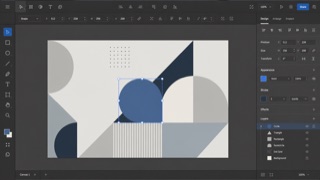
Adobe's cross-application design system. Under the principles Rational, Human and Focused, it changes density between desktop and mobile while keeping tool-heavy interfaces from pulling attention away from the work itself.
Fluent 2
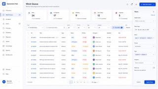
Tokenizes color, type, spacing, radius and depth, deploying Solid, Acrylic, Mica and Smoke materials by role across Microsoft products.
| Adobe Spectrum | Fluent 2 | |
|---|---|---|
| Era | 2013– | 2022– |
| Family | Platform Screen Languages | Microsoft UI |
| Kind | Style | Style |
| Cues | Neutral surfaces with vivid color reserved for selection / Icons, type and borders scaling together / Toolbars and property panels joined by fine divisions / The creative work stays stronger than the interface | Mica and Acrylic / Neutral tonal hierarchy / Soft corner radii / Tokenized depth |
| Best used for | Creative tools for image, video or documents where controls should recede · Moving one product between desktop and mobile with a systematic density change | Business UI at home in Windows and Microsoft 365 that several teams must keep identical · Replacing an existing product in stages so theme and state stay consistent across products |
| Type | Use a sans that survives small labels; optimize for identifying actions, not dramatic headings. | Define size and leading as tokens and never hardcode values in a screen. |
| Composition | Keep the canvas central and tools at the edges; change every element through the same density scale. | Fix spacing to multiples of one base and keep density variants as separate tokens. |
| Material | Build with steps of neutral color and assign vivid color only to selection, focus and warning. | Mica for the window ground, Acrylic only for surfaces that appear briefly. |
| Caution | A dark panel does not make a creative tool. Mixed density scales blur the line between an action and a readout. | Match blur and shadow to surface role, window state and light, dark and high contrast. Adding one off colors and paddings per screen turns the unifying system into one more thing to maintain. |