Metro
メトロ / 2010–2015 / Stil / Microsoft UI
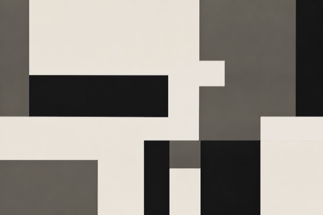
Die flache Formensprache von Windows Phone gab der Schrift statt den Icons die Hauptrolle. Große Typografie, einfarbige Live Tiles und über den Bildschirmrand laufende Kompositionen verpflanzten die Klarheit von Verkehrsleitsystemen ins Interface und eröffneten die Flat-Ära noch vor iOS 7.


Auf einen Blick
Visuelle Merkmale
- Schrift als Hauptdarsteller
- Einfarbige Kacheln
- Über den Bildschirmrand hinauslaufende Kompositionen
- Beseitigtes Interface-Chrome
Geeignet für
- Übersichten für Nachrichten oder Wetter, die ganz ohne Rahmenlinien auskommen
- Wegweisung und Bildschirme im Innenraum, die aus der Ferne in einem Wort lesbar sind
Diesen Stil verwenden
Nutze das Kurzbriefing im Projekt oder übergib die strukturierte Spezifikation an ein KI-Werkzeug.
Ausführliche Anleitung und QuellenProduktionsregeln, Referenzwerke, Vergleiche, Forschung und Zitate
Wörterbucheintrag
- Typografie
- Überschriften mindestens fünfmal so groß wie der Text, im leichten Schnitt vergrößert
- Komposition
- Überschriften laufen aus dem Bild, Kacheln nur in zwei Rechteckgrößen
- Material
- Weder Schatten noch Rahmen, schwarzer oder weißer Grund, gesättigte einfarbige Flächen
- Zu vermeiden
- Ohne Rahmen und Schatten verschwindet der Unterschied zwischen einer antippbaren Kachel und einer bloßen Überschrift, und die Nutzenden wissen nicht, wohin sie greifen sollen
- Zum Weiterlesen
- from Zune HD to Windows Phone 7 / the transit-signage influence behind the name / the inheritance into Fluent
Verwandte Einträge
- Flat Design / Vector Minimalism (フラットデザイン / ベクターミニマリズム)Gemeinsame Wirkungen: Trust.Metro und Flat Design / Vector Minimalism vergleichen
- Swiss (スイス・スタイル)Gemeinsame Wirkungen: Trust.Metro und Swiss vergleichen
Wird oft verwechselt mit
Mehr aus Microsoft UI
Weitere Stile aus Microsoft UI, nach gemeinsamen Wirkungen geordnet.
- Fluent 2 (フルーエント2)Gemeinsame Wirkungen: Trust / Technique.
- Windows 95 Interface (Windows 95 インターフェース)Gemeinsame Wirkungen: Trust / Technique.
- Ribbon (リボン)Gemeinsame Wirkungen: Trust / Technique.
Alle Einträge aus Microsoft UI ansehen
Diesen Eintrag zitieren
Das Wörterbuch ist zum Verlinken gedacht. Nehmen Sie die Form, die dorthin passt, wo Sie schreiben.
- Link
- https://indexstyle.org/de/styles/metro
- Markdown
- [Metro — IndexStyle](https://indexstyle.org/de/styles/metro)
- HTML
- <a href="https://indexstyle.org/de/styles/metro">Metro — IndexStyle</a>