Web Brutalism vs Web 1.0
ウェブ・ブルータリズム / ウェブ1.0
Blue underlined links, system fonts and a bare undecorated page make the two look almost the same.
How to tell them apart. Low resolution GIFs and homemade buttons mean Web 1.0. Type sizes flung to extremes on purpose mean Web Brutalism.
Web Brutalism
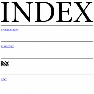
Puts the browser's default rendering straight on screen and refuses the finished look of templates. The bare structure of the HTML becomes the style itself.
Web 1.0

Reuses the naivety of the constrained early web as directness and charm. In the 2020s it came back as a movement to take the personal site back, gathering under names like Neocities and Yesterweb.
| Web Brutalism | Web 1.0 | |
|---|---|---|
| Era | 2014– | 1990s |
| Family | UI Expression | Digital Retro |
| Kind | Style | Style |
| Cues | Default headings and links / Blue underlined links / Extreme jumps in size / Rules and white space without ornament | Blue links / Low-res GIFs / System fonts / Plain buttons |
| Best used for | Gallery and label announcements that choose speed of information over polish · Putting deliberate distance between you and template-built competitors | Showing affection for internet culture · An unpolished, approachable feel |
| Type | Keep the default face and push only the headings to full page width | System sans and monospace |
| Composition | Drop the columns, stack in one vertical run, divide with rules and space | Left-aligned, borders, table-like division |
| Material | White or one flat ground, images left compressed and placed at actual size | White background, blue links, dithered images |
| Caution | Tidying only the margins and line lengths while posing as the browser default makes the plainness read as staging, and readers quit while still hunting for a reason behind the mess. | Don't regress actual accessibility. Separate the look from interaction quality. |