Vectordelia vs Vectorheart
ベクターデリア / ベクターハート
Both sit in Digital Retro, so the question is not what they belong to but how they behave. They are reached for with some of the same intent, which is where they get confused.
Vectordelia
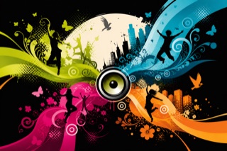
A mid-2000s to early-2010s visual language that made flat vector graphics proliferate across advertising, music graphics and game interfaces. Vivid curves, flowers, birds, human silhouettes, speakers, splashes and gradient blocks spread outward from a center. It was named Vectordelia or Frutiger Metro retrospectively; it predates and is distinct from Microsoft's typographic Metro interface.
Vectorheart
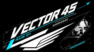
A graphic style compressing Y2K speed into sharp vector forms, industrial symbols, and high-contrast type. Flatter than Metalheart's heavy 3D chrome, it turns Swiss modern and machine-display order into aggressive bevelled angles.
| Vectordelia | Vectorheart | |
|---|---|---|
| Era | mid-2000s–early 2010s / retrospective name | late 1990s–mid-2000s |
| Family | Digital Retro | Digital Retro |
| Kind | Style | Style |
| Cues | Thick curves, vines, flowers, splashes and concentric rings growing outward from a center / Dancing people, birds, butterflies, skylines and speakers layered as silhouettes / Lime, cyan, magenta and orange planes and gradients colliding with black or white / Thin humanist sans-serif type contrasting with expansive vector ornament | 45-degree notches, arrows, wings, and speed lines / Extreme contrast between very heavy and very light type / Numbers, warning rules, coordinates, and fictional industrial labels / Monochrome or dark fields with one red, yellow, or cyan accent |
| Best used for | Concentrating motion and abundance into flat graphics for music, festivals or youth-facing services without photography · Recreating 2000s digital culture in exhibitions or games as vector proliferation rather than glossy 3D | Game, sports, and electronic-music identities built from technical symbols instead of 3D · Reconstructing Y2K graphics through vectors and typography rather than chrome |
| Type | Set short copy in a light humanist sans-serif inside gaps in the curves; do not outline the letters like the ornament. | Attach tiny monospaced labels and numbers tightly to an angular ultra-bold headline. |
| Composition | Grow broad curves in three directions from the subject, layer silhouettes and floral forms at varied scales, and reserve one solid area for reading. | Run one 45-degree direction through headline, arrows, and image crops. |
| Material | Use crisp vector planes, transparent gradients, halftones and splatter brushes, limiting photographic texture to one point. | Use flat vectors, thin warning lines, and limited color, creating depth from overlap and cuts rather than bevels. |
| Caution | Do not merely flatten Frutiger Aero's sky and gloss, and do not confuse it with Microsoft's Metro UI. Curves, silhouettes and music or nature motifs must form one continuous visual flow. | Chrome and bevel effects turn it into Metalheart. Vectorheart gets speed from flat cuts, disciplined symbols, and a unified angle. |