Single-Serving Site vs Web Brutalism
シングルサービング・サイト / ウェブ・ブルータリズム
Single-Serving Site comes from Reading on the Web and Web Brutalism from UI Expression. One is layout and the other style. They are reached for with some of the same intent, which is where they get confused.
Single-Serving Site
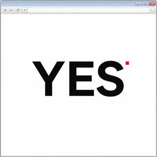
A site made of a single page on its own domain that does exactly one thing. Jason Kottke gave the form its name in February 2008, and around four hundred readers wrote in with examples, which is how it settled into a recognised type. There is no navigation and nowhere to go next: the answer fills the screen and that is the whole site.
Web Brutalism
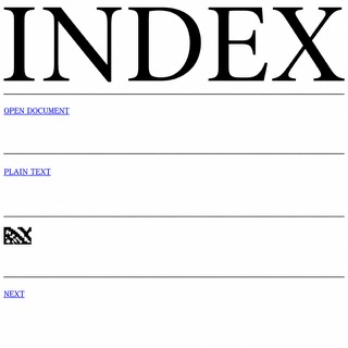
Puts the browser's default rendering straight on screen and refuses the finished look of templates. The bare structure of the HTML becomes the style itself.
| Single-Serving Site | Web Brutalism | |
|---|---|---|
| Era | 2008– | 2014– |
| Family | Reading on the Web | UI Expression |
| Kind | Layout | Style |
| Cues | The domain name is the question and the page holds nothing but the one word answer / No heading and no paragraph, just one word or one image occupying the middle of the screen / No menu, no search and no footer links, so there is nowhere the visitor can go next / Titles that can be answered yes or no, in the manner of Is It Christmas? and Is Twitter Down? | Default headings and links / Blue underlined links / Extreme jumps in size / Rules and white space without ornament |
| Best used for | Building a page that answers one question, by putting the answer in the middle as a single word and cutting everything else · Publishing a notice or a status readout on its own domain as one page with no header and no footer | Gallery and label announcements that choose speed of information over polish · Putting deliberate distance between you and template-built competitors |
| Type | Blow the answer up to the width of the viewport. One typeface, and no other text anywhere on the page. | Keep the default face and push only the headings to full page width |
| Composition | One page, one screenful, nothing below the fold. A single element in the centre and margin everywhere else. | Drop the columns, stack in one vertical run, divide with rules and space |
| Material | A flat background colour. No ornament and no layering; when the answer changes, only the word or the colour swaps. | White or one flat ground, images left compressed and placed at actual size |
| Caution | Keeping it to one page but adding explanatory copy, share buttons and related links breaks the only rule that matters, and what is left is just a short landing page. | Tidying only the margins and line lengths while posing as the browser default makes the plainness read as staging, and readers quit while still hunting for a reason behind the mess. |