Neubrutalism vs Web Brutalism
ニューブルータリズム / ウェブ・ブルータリズム
Both are blunt screens that refuse decoration, with oversized type and rough spacing left as they fall, and even the names sit close.
How to tell them apart. Heavy black frames, offset hard shadows and primary color planes mean Neubrutalism. Browser default headings and blue links mean Web Brutalism.
Neubrutalism
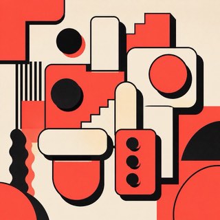
Rebels warmly against the over-polished web with thick borders and blunt color.
Web Brutalism
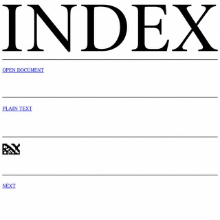
Puts the browser's default rendering straight on screen and refuses the finished look of templates. The bare structure of the HTML becomes the style itself.
| Neubrutalism | Web Brutalism | |
|---|---|---|
| Era | 2010s– | 2014– |
| Family | UI Expression | UI Expression |
| Kind | Style | Style |
| Cues | Thick black borders / Hard shadows / Vivid color / Flat components | Default headings and links / Blue underlined links / Extreme jumps in size / Rules and white space without ornament |
| Best used for | Making a product frank and memorable · Humanity for communities and creator tools | Gallery and label announcements that choose speed of information over polish · Putting deliberate distance between you and template-built competitors |
| Type | Bold sans, monospace | Keep the default face and push only the headings to full page width |
| Composition | Divide into clear boxes; shadows in one direction | Drop the columns, stack in one vertical run, divide with rules and space |
| Material | Off-white plus vivid color, black borders, few rounded corners | White or one flat ground, images left compressed and placed at actual size |
| Caution | Don't border and shadow everything. Vary the strength by hierarchy. | Tidying only the margins and line lengths while posing as the browser default makes the plainness read as staging, and readers quit while still hunting for a reason behind the mess. |