Metalheart vs Y2K
メタルハート / ワイツーケー
Metalheart comes from UI Expression and Y2K from Digital Retro. They are reached for with some of the same intent, which is where they get confused.
Metalheart
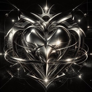
Early 3D software gave this fin-de-millénaire style its chrome, liquid metal, aggressive bevels and lens flare. Dressed in techno and science-fiction imagery, it ruled rave flyers and games magazines around Y2K.
Y2K


.jpg)
Expresses optimism for the new millennium in translucent plastic and rounded futures. Its shine comes from resin and metal you could hold rather than from a screen, which separates it from the interface gloss of the same years.
| Metalheart | Y2K | |
|---|---|---|
| Era | 1995–2004 | late 1990s–2000s |
| Family | UI Expression | Digital Retro |
| Kind | Style | Style |
| Cues | Liquid-metal chrome / Aggressive bevels / Lens flares / Techno and sci-fi typography | Translucent plastic / Silver / Bubble forms / Cyber brightness |
| Best used for | Club and rave announcements rebuilt with the texture of that era's 3D · Showing off technology through excess instead of refinement | A light futurity for fashion and youth culture · Tech expression that isn't too serious |
| Type | Extrude the letters, bevel them deep, and bake in mirror reflections | Rounded extended faces, pixel accents |
| Composition | One large object at center, the ground filled with grids and beams | Floating ellipses with a centered logo |
| Material | Chrome, liquid metal, lens flare, reflections carrying surrounding color | Aqua, lime, silver, transparency |
| Caution | Polishing it clean in current software removes the rawness that came from the crude renderers of the time, and it becomes something else. | Don't lean on chrome and butterflies. Put the era's optimism into the message too. |