Memphis vs Neubrutalism
メンフィス / ニューブルータリズム
Memphis comes from Pop and Neubrutalism from UI Expression. They are reached for with some of the same intent, which is where they get confused.
Memphis


.jpg)
Laughs off functionalism and enjoys the dissonance of shape and color.
Neubrutalism
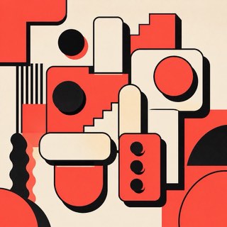
Rebels warmly against the over-polished web with thick borders and blunt color.
| Memphis | Neubrutalism | |
|---|---|---|
| Era | 1980s | 2010s– |
| Family | Pop | UI Expression |
| Kind | Style | Style |
| Cues | Zigzags / Small figures / Pastel plus primary / Speckles | Thick black borders / Hard shadows / Vivid color / Flat components |
| Best used for | Softening a stiff subject · A young, sunny personality | Making a product frank and memorable · Humanity for communities and creator tools |
| Type | A chunky geometric sans | Bold sans, monospace |
| Composition | Scatter small motifs, anchor with one large shape | Divide into clear boxes; shadows in one direction |
| Material | Pink, yellow, teal, black speckles | Off-white plus vivid color, black borders, few rounded corners |
| Caution | Don't stop at background pattern. Map the figures to navigation and units of meaning. | Don't border and shadow everything. Vary the strength by hierarchy. |