Liquid Glass vs visionOS Spatial Design
リキッドガラス / visionOS 空間デザイン
Both sit in Apple UI, so the question is not what they belong to but how they behave. They are reached for with some of the same intent, which is where they get confused.
Liquid Glass
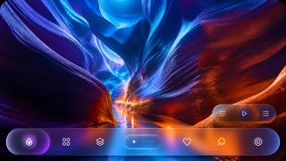
Unifies the floating control and navigation layer as a fluid glass material that refracts and adapts to the content beneath.
visionOS Spatial Design


The screen language Apple set out for Vision Pro in its Human Interface Guidelines. A window is an upright plane whose background is a material Apple calls glass, so the room shows through it while specular reflections and shadows report where the plane sits and how big it is. visionOS defines a point as an angle rather than a count of pixels, which keeps a window's apparent size constant as it moves away.
| Liquid Glass | visionOS Spatial Design | |
|---|---|---|
| Era | 2025– | 2023– |
| Family | Apple UI | Apple UI |
| Kind | Style | Style |
| Cues | Dynamic refraction / Concentric corner radii / Floating control layers / Reflected background color | An upright plane with a glass background that cannot be swapped out, carrying specular reflections and shadows / A default window of 1280x720 pt, opening about two metres away with an apparent width near three metres / A hover effect that lights only the element being looked at, with one rounded target region per control / Volumes have no visible frame, and their close button and window bar rotate to face whoever walks around them |
| Best used for | Apps that show content full bleed while floating only the controls above it. · Screens where light, dark and wallpaper change but control positions must hold. | Reworking an iPad layout into a panel that stays legible while floating over a real room · Showing a product model at life size, placed in the room as a frameless volume rather than a window |
| Type | Keep text off the material itself and set minimum sizes from measured contrast. | Use SF Pro, choosing the heavier body and title steps this platform provides. Default to white text and keep the glyphs themselves flat. Labels tied to a point in space should always turn to face the viewer. |
| Composition | Hold controls to the edges and make inner and outer radii concentric. | Start from 1280x720 pt and let the content decide the proportion. Leave at least 16 pt of margin around each interactive item and keep centres at least 60 pt apart. Always set a minimum and a maximum window size. |
| Material | Use one refracting layer only, letting it pick up the color beneath. | Keep the glass background. Build depth from shadow, specular reflection and colour temperature, never from raised text. Keep any 3D inside a window shallow and move deeper objects into a volume. |
| Caution | Keep it to the control layer rather than decorating content with translucent cards. Each added layer lets more background through until text fails, so check legibility on devices and honor Reduce Transparency. | Replacing the glass with an opaque fill breaks the visual relationship between elements, hurts legibility, and makes the window feel heavy because it hides the room behind it. |