Postwar Japanese Poster vs Ukiyo-e
戦後日本のポスターデザイン / 浮世絵
Postwar Japanese Poster comes from Regional Graphics and Ukiyo-e from Japanese Woodblock Prints. Both are read here as style. They are reached for with some of the same intent, which is where they get confused.
Postwar Japanese Poster
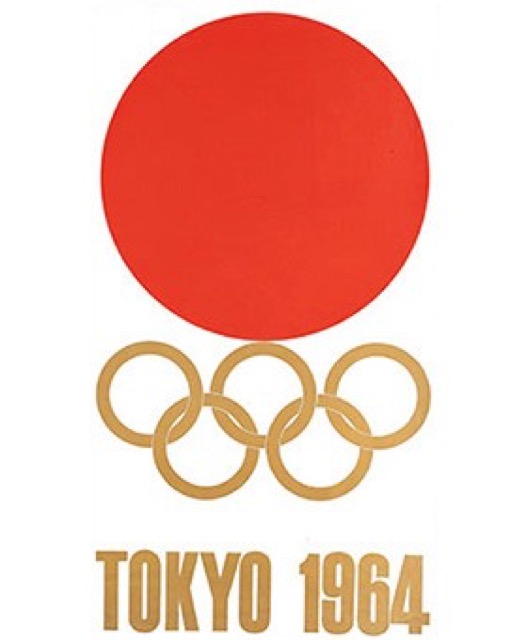
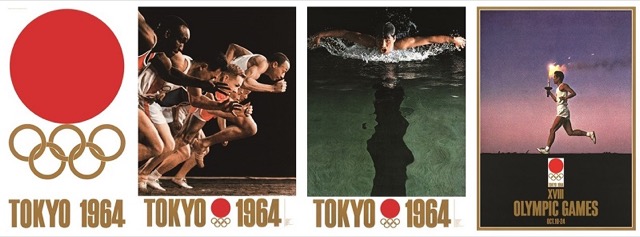
.jpg)
Photography, flat color, calligraphy and traditional motifs, recomposed differently by each designer.
Ukiyo-e


Fixes a passing moment of daily life or landscape into strong composition with contour, flat color and daring crops.
| Postwar Japanese Poster | Ukiyo-e | |
|---|---|---|
| Era | 1950s–1990s | 17th–19th century |
| Family | Regional Graphics | Japanese Woodblock Prints |
| Kind | Style | Style |
| Cues | Bold flatness / Photography and calligraphy / Personal symbols / Precise construction | Clear outlines / Flat color / Bold cropping / Overlapping space |
| Best used for | Announcing an exhibition or a cultural program with one image and little copy · Setting mixed Japanese and Latin text precisely so it reads as high grade | Giving daily scenes a symbolic composition · Showing depth by overlap instead of realism |
| Type | Tighten Japanese text into a block and divide roles between calligraphy and type | Brush letters or a disciplined mincho fitting the subject; no meaningless Japanese |
| Composition | Run a central axis, fix the margins, then cut down to a few elements | Cut the foreground boldly; set a jump in scale against the distance |
| Material | Flat printed color, photographic tone, the white of the paper, few inks laid heavily | Keylines and few color blocks; use the paper as one of the colors |
| Caution | Placing traditional motifs is only borrowing. Do not flatten the work into one Japanese look, and check how construction differs by designer, decade and advertised subject. | Not a kit of 'Japanese-style' signs. Research the artist, carver, printer, period and subject. |