Holo vs Sailfish Silica
ホロ / Sailfish Silica
Holo comes from Google UI and Sailfish Silica from Platform Screen Languages. They are reached for with some of the same intent, which is where they get confused.
Holo


Google's design language for Android, introduced with 3.0 and pushed so hard that carrying it unmodified became a compatibility requirement for every 4.0 device. It rules a black ground with hairlines and lets a single cyan blue carry selection, focus and progress. It arrived as a guarantee as much as a look, since an app that asked for the theme by name would be drawn the same way even on a phone wearing a manufacturer's skin.
Sailfish Silica
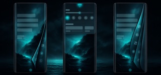
Sailfish OS's QML language centers the mobile experience on edge gestures and Ambience: wallpaper color runs through translucent type and highlights, while the screen edge itself becomes back, close and switch.
| Holo | Sailfish Silica | |
|---|---|---|
| Era | 2011–2014 | 2013– |
| Family | Google UI | Platform Screen Languages |
| Kind | Style | Style |
| Cues | White text on black, with sections divided by one pixel hairlines instead of filled panels / A single cyan blue at #33B5E5 lighting only selection, the underline of a text field, and progress / A full width action bar pinned to the top, and a strip of Back, Home and Recents keys at the bottom / Tab labels and list section headers set in bold, all uppercase | Text and focus tinted from the wallpaper / Translucent controls floating over dark imagery / Layers peeled by swipes from screen edges / Pulley Menu revealed by pulling, with generous spacing |
| Best used for | Recreating an Android app screen from roughly 2011 to 2013 with the period's actual widgets and theme names · Building hierarchy in a dark admin screen from hairlines and one accent color, without adding panels or shadows | Mobile applications that concentrate one-handed navigation in edge gestures · Coloring system UI and wallpaper into one personal ambience |
| Type | One geometric leaning sans across the whole interface, in two weights only. Tabs and section headers go uppercase with the tracking opened slightly. | Use light, large sans text and write only current state and next action. |
| Composition | A full width action bar is fixed at the top and a single column list fills the space under it. Sections are separated by hairlines rather than white space, and a strip is reserved at the bottom for the navigation keys. | Place content on one vertical plane and assign back, close and menu to edge and pull gestures. |
| Material | Ground is black or a pale #F3F3F3, text is white or dark gray, and rules are one pixel of white at reduced opacity. Restrict the accent to #33B5E5 alone and let it glow only on press, selection and progress. | Start from a dark wallpaper, use one extracted highlight color and vary white transparency for primary and secondary text. |
| Caution | Redrawing the widgets so they no longer inherit from the theme throws away the one thing this style buys you, which is looking identical across devices, and leaves your app the odd one out on a skinned phone. | Dark wallpaper and thin type alone are not Silica. Edge gestures, Pulley Menu and Ambience color must form one operation model. |