Graffiti Pop vs Mission School
グラフィティ・ポップ / ミッション・スクール
Graffiti Pop comes from Illustration Styles and Mission School from Street Style. They are reached for with some of the same intent, which is where they get confused.
Graffiti Pop
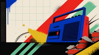
A 1980s–90s commercial style in which advertising, television, toys, and fashion turned graffiti and the contemporary street into a clean, readable urban stage. Separate from writers’ signature culture, it arranged spray lines, brick, chain-link, bins, and boomboxes behind Pop-like products.
Mission School
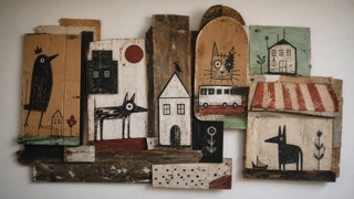
A 1990s San Francisco DIY art language that mixed storefront signs, skating, comics, folk art, urban scrap, small drawings, and handmade installations to record life and change around the Mission District.
| Graffiti Pop | Mission School | |
|---|---|---|
| Era | early 1980s–mid-1990s | 1990s–early 2000s |
| Family | Illustration Styles | Street Style |
| Kind | Style | Style |
| Cues | Bright spray lines, splatter, and heavy outlines behind products / Brick, chain-link, lamps, sidewalks, and bins compressed into a shallow stage / High-contrast black, white, red, yellow, and turquoise / Hand-drawn headlines above orderly product names and prices | Work on cardboard, scrap wood, and reused signs / Comic figures and dense hand lettering / Worn local color led by brown, black, and red / Improvised displays linking skating, shops, and street life |
| Best used for | Critically showing how street culture was converted into a product backdrop in 1980s–90s advertising · Contrasting readable commercial information with drawn motion in fictional urban sets | Joining local shops, street life, music, and skating into one handmade exhibition · Recording neighborhood change through drawing and reused material instead of new production |
| Type | Draw only a short fictional headline in a wide hand style; return product, price, and safety copy to an orderly sans. | Mix sign painting with small handwriting instead of unifying everything into a polished logo. |
| Composition | Keep the central product or figure clear and use no more than three surrounding layers of brick, mesh, and spray lines. | Cluster boards, papers, and photographs so fragments reveal themselves while the viewer walks. |
| Material | Use flat spot color, rough airbrush, print halftone, and painted plywood without reproducing a real tag or signature. | Use scrap wood, cardboard, latex paint, pencil, and copier paper, preserving earlier words and damage. |
| Caution | Do not imitate a living or historical graffiti writer’s tag, lettering, or mural. Do not reduce poverty and decay to cool urban props; explain the commercializing context. | Do not borrow rough drawing while deleting the place. Name the Mission community, artist relationships, and gentrification context. |