Glassmorphism vs Liquid Glass
グラスモーフィズム / リキッドガラス
Both are made of layers that blur and pass the background through, and in both a rounded sheet floats over the content.
How to tell them apart. Liquid Glass refracts the color behind it, so motion changes the distortion and the light along the edge. Glassmorphism blurs evenly and stays put.
Glassmorphism


Shows depth and hierarchy through translucent layers, floating information lightly.
Liquid Glass
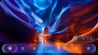
Unifies the floating control and navigation layer as a fluid glass material that refracts and adapts to the content beneath.
| Glassmorphism | Liquid Glass | |
|---|---|---|
| Era | 2020s | 2025– |
| Family | UI Expression | Apple UI |
| Kind | Style | Style |
| Cues | Background blur / Translucency / Thin white borders / Color bleed | Dynamic refraction / Concentric corner radii / Floating control layers / Reflected background color |
| Best used for | Making layered information feel light · OS-grade refinement and depth | Apps that show content full bleed while floating only the controls above it. · Screens where light, dark and wallpaper change but control positions must hold. |
| Type | A neutral sans-serif | Keep text off the material itself and set minimum sizes from measured contrast. |
| Composition | Stack cards with clear front-to-back order | Hold controls to the edges and make inner and outer radii concentric. |
| Material | Colored ground, translucent panes, fine edges | Use one refracting layer only, letting it pick up the color beneath. |
| Caution | Legibility breaks with the wrong background. Give text surfaces real opacity. | Keep it to the control layer rather than decorating content with translucent cards. Each added layer lets more background through until text fails, so check legibility on devices and honor Reduce Transparency. |