Glassmorphism vs Gradient Mesh
グラスモーフィズム / グラデーション・メッシュ
Glassmorphism comes from UI Expression and Gradient Mesh from Painting Techniques. One is style and the other technique. They are reached for with some of the same intent, which is where they get confused.
Glassmorphism


Shows depth and hierarchy through translucent layers, floating information lightly.
Gradient Mesh
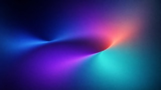
Blends several color focal points smoothly, giving a flat plane the depth of light and atmosphere.
| Glassmorphism | Gradient Mesh | |
|---|---|---|
| Era | 2020s | digital–contemporary |
| Family | UI Expression | Painting Techniques |
| Kind | Style | Technique |
| Cues | Background blur / Translucency / Thin white borders / Color bleed | Multi-point gradients / Bleeding light / Large color fields / Soft depth |
| Best used for | Making layered information feel light · OS-grade refinement and depth | An emotional backdrop for abstract service value · Rich atmosphere without photography |
| Type | A neutral sans-serif | Keep the type solid and sharp-edged |
| Composition | Stack cards with clear front-to-back order | Offset the color's focus from the type's focus; protect the margins |
| Material | Colored ground, translucent panes, fine edges | Three or four colors, low noise, a core of light and dark |
| Caution | Legibility breaks with the wrong background. Give text surfaces real opacity. | Check contrast on the real screen so the ground never swallows the type. |