FUI (Fantasy User Interface) vs The New Aesthetic
架空ユーザーインターフェース / ニュー・エステティック
FUI (Fantasy User Interface) comes from UI Expression and The New Aesthetic from Digital Culture. One is style and the other aesthetic. They are reached for with some of the same intent, which is where they get confused.
FUI (Fantasy User Interface)


The name that stuck to the craft of making the screens that appear inside films. It spread around the work of Mark Coleran, who says he is given credit for the term without being sure he can take it, and who describes these screens as illustration and a storytelling device that was never designed to be used. He works with light, shape, form, movement and sound so that each film screen has one thing the audience is meant to read.
The New Aesthetic
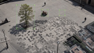
James Bridle's New Aesthetic names the way machine vision and network imagery leak into physical culture through pixels, satellite views, detection boxes and sensor errors.
| FUI (Fantasy User Interface) | The New Aesthetic | |
|---|---|---|
| Era | 1997– | 2011– |
| Family | UI Expression | Digital Culture |
| Kind | Style | Aesthetic |
| Cues | One thing per screen that the audience is meant to read, with everything else present as density / Columns of monospaced figures updating continuously while computing nothing / Thin luminous lines on black, with shapes drawn as outlines and almost no fill / Frames and controls that look like plausible equipment rather than pure abstraction | Pixels enlarged onto physical objects / Recognition rectangles and coordinates / Satellite, map and surveillance viewpoints / Compression, omission and machine misclassification |
| Best used for | Designing a screen that has to be read in the few seconds an actor is looking at it · Designing the display of a device that does not exist, as a picture that never has to work | Critically visualizing AI, surveillance and mapping · Showing where human and machine perception diverge |
| Type | Lead with monospace and let most of the text act as texture. Only the word that must be read changes size and brightness. | Set coordinates, labels and confidence scores on a separate layer from human explanation. |
| Composition | Decide the one thing to be read first and aim the light and the motion at it. Fill the rest with density that carries no meaning. | Overlay detection boxes, tracks and map tiles to expose the machine's field of judgment. |
| Material | One or two luminous colours on black, thin strokes, almost no fill. Pull the brightness down so the screen sits inside the photographed shot. | Leave low resolution, compression and sensor output visibly unresolved. |
| Caution | Trying to make the screen genuinely operable thins out the density and scatters the information, and it stops being readable in the length of the performance. | Pixels and detection boxes used only as futuristic decoration erase the politics of who classifies whom. |