FUI (Fantasy User Interface) vs Metalheart
架空ユーザーインターフェース / メタルハート
Both sit in UI Expression, so the question is not what they belong to but how they behave. They are reached for with some of the same intent, which is where they get confused.
FUI (Fantasy User Interface)


The name that stuck to the craft of making the screens that appear inside films. It spread around the work of Mark Coleran, who says he is given credit for the term without being sure he can take it, and who describes these screens as illustration and a storytelling device that was never designed to be used. He works with light, shape, form, movement and sound so that each film screen has one thing the audience is meant to read.
Metalheart
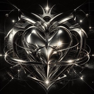
Early 3D software gave this fin-de-millénaire style its chrome, liquid metal, aggressive bevels and lens flare. Dressed in techno and science-fiction imagery, it ruled rave flyers and games magazines around Y2K.
| FUI (Fantasy User Interface) | Metalheart | |
|---|---|---|
| Era | 1997– | 1995–2004 |
| Family | UI Expression | UI Expression |
| Kind | Style | Style |
| Cues | One thing per screen that the audience is meant to read, with everything else present as density / Columns of monospaced figures updating continuously while computing nothing / Thin luminous lines on black, with shapes drawn as outlines and almost no fill / Frames and controls that look like plausible equipment rather than pure abstraction | Liquid-metal chrome / Aggressive bevels / Lens flares / Techno and sci-fi typography |
| Best used for | Designing a screen that has to be read in the few seconds an actor is looking at it · Designing the display of a device that does not exist, as a picture that never has to work | Club and rave announcements rebuilt with the texture of that era's 3D · Showing off technology through excess instead of refinement |
| Type | Lead with monospace and let most of the text act as texture. Only the word that must be read changes size and brightness. | Extrude the letters, bevel them deep, and bake in mirror reflections |
| Composition | Decide the one thing to be read first and aim the light and the motion at it. Fill the rest with density that carries no meaning. | One large object at center, the ground filled with grids and beams |
| Material | One or two luminous colours on black, thin strokes, almost no fill. Pull the brightness down so the screen sits inside the photographed shot. | Chrome, liquid metal, lens flare, reflections carrying surrounding color |
| Caution | Trying to make the screen genuinely operable thins out the density and scatters the information, and it stops being readable in the length of the performance. | Polishing it clean in current software removes the rawness that came from the crude renderers of the time, and it becomes something else. |