Flat Design / Vector Minimalism vs Grunge
フラットデザイン / ベクターミニマリズム / グランジ
Flat Design / Vector Minimalism comes from UI Expression and Grunge from Counterculture. They are reached for with different intent, which is the fastest way to tell them apart.
Flat Design / Vector Minimalism


Reduces information to plain planes and color, portable across screens and media.
Grunge
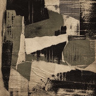
Uses dirt, tears and wear as resistance to the neatly managed screen.
| Flat Design / Vector Minimalism | Grunge | |
|---|---|---|
| Era | 2010s– | 1990s |
| Family | UI Expression | Counterculture |
| Kind | Style | Style |
| Cues | Uniform planes / Simple shapes / Few shadows / Clear color | Scuffing / Tears / Disordered type / Low-quality copies |
| Best used for | Light, understandable explanation · Large sets of consistent figures | Body heat for music and street culture · Deliberately breaking the look of a finished product |
| Type | A rounded sans-serif | Decayed sans, typewriter faces |
| Composition | Simple silhouettes and clear hierarchy | Overlap and crop; keep alignment only in places |
| Material | Three to five colors; shadows only when they mean something | Dirty paper, grain, low chroma plus one accent |
| Caution | Figures easily become generic. Define your own ratios, lines and color rules. | Texture overlays alone feel dated. Run the logic of wear through photo, type and margin alike. |