Figuration Libre vs Graffiti Pop
フィギュラシオン・リーブル / グラフィティ・ポップ
Figuration Libre comes from Pop and Graffiti Pop from Illustration Styles. They are reached for with some of the same intent, which is where they get confused.
Figuration Libre
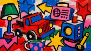
A 1980s French return to figuration that released comics, rock, television, advertising, and graffiti into fast contours, saturated flat color, painted stories, walls, and posters.
Graffiti Pop
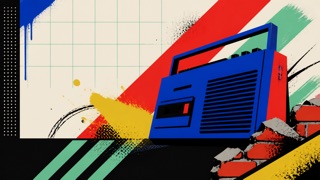
A 1980s–90s commercial style in which advertising, television, toys, and fashion turned graffiti and the contemporary street into a clean, readable urban stage. Separate from writers’ signature culture, it arranged spray lines, brick, chain-link, bins, and boomboxes behind Pop-like products.
| Figuration Libre | Graffiti Pop | |
|---|---|---|
| Era | 1980s | early 1980s–mid-1990s |
| Family | Pop | Illustration Styles |
| Kind | Style | Style |
| Cues | Comic figures with heavy black contour / Flat saturated red, yellow, blue, and green / Words, signs, and panel-like divisions inside the image / Fast large marks associated with murals and posters | Bright spray lines, splatter, and heavy outlines behind products / Brick, chain-link, lamps, sidewalks, and bins compressed into a shallow stage / High-contrast black, white, red, yellow, and turquoise / Hand-drawn headlines above orderly product names and prices |
| Best used for | Releasing story and text into a bright large field for music or comics · Prioritizing hand-painted speed and crowded figures over polished Pop Art | Critically showing how street culture was converted into a product backdrop in 1980s–90s advertising · Contrasting readable commercial information with drawn motion in fictional urban sets |
| Type | Make heavy hand lettering part of the image and separate explanatory body copy. | Draw only a short fictional headline in a wide hand style; return product, price, and safety copy to an orderly sans. |
| Composition | Surround a central figure with small figures, words, and signs until forms fill the gaps. | Keep the central product or figure clear and use no more than three surrounding layers of brick, mesh, and spray lines. |
| Material | Draw directly in acrylic, marker, or enamel on white, retaining correction and line wobble. | Use flat spot color, rough airbrush, print halftone, and painted plywood without reproducing a real tag or signature. |
| Caution | Do not reduce it to colorful graffiti. State the 1980s French artists, popular-media circulation, and return to the figure. | Do not imitate a living or historical graffiti writer’s tag, lettering, or mural. Do not reduce poverty and decay to cool urban props; explain the commercializing context. |