Claymorphism vs Neumorphism
クレイモーフィズム / ニューモーフィズム
Rounded parts in pastels close to the ground color, soft shadow all round, and no outline anywhere, in both.
How to tell them apart. In Neumorphism the same surface as the ground rises and sinks. In Claymorphism the part lifts off the ground as a thick separate lump.
Claymorphism
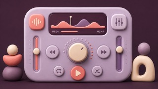
Makes digital components soft and playable with rounded, clay-like volume.
Neumorphism


Makes background and controls one material, showing relief through soft shadow alone.
| Claymorphism | Neumorphism | |
|---|---|---|
| Era | 2020s | late 2010s– |
| Family | UI Expression | UI Expression |
| Kind | Style | Style |
| Cues | Inflated forms / Inner highlights / Soft shadows / Pastels | Same-color surfaces / Two-direction shadows / Rounded parts / Low contrast |
| Best used for | Making education, wellness and onboarding friendly · 3D icons with character | Concept screens with few interactions · A soft, quiet product impression |
| Type | A rounded sans-serif | A concise sans-serif |
| Composition | One large dimensional object and a short caption | Big margins, few controls |
| Material | Tonal lights and darks, rounded corners, a soft contact shadow | Pale ground, one light and one dark shadow, rounded corners |
| Caution | Don't leave control states to shadows alone. Reserve the volume for the hero. | Contrast failure comes easily. Mark key actions and states with color and outline too. |