Claymorphism vs Kidcore
クレイモーフィズム / キッドコア
Claymorphism comes from UI Expression and Kidcore from Pop. They are reached for with some of the same intent, which is where they get confused.
Claymorphism
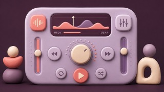
Makes digital components soft and playable with rounded, clay-like volume.
Kidcore

.jpg)

Recalls toys, stickers and school supplies in unconditionally bright color.
| Claymorphism | Kidcore | |
|---|---|---|
| Era | 2020s | 1990s nostalgia |
| Family | UI Expression | Pop |
| Kind | Style | Style |
| Cues | Inflated forms / Inner highlights / Soft shadows / Pastels | Primary colors / Smileys / Rainbows / Toy shapes |
| Best used for | Making education, wellness and onboarding friendly · 3D icons with character | Evoking childhood freedom and safety · Making a community look sunny |
| Type | A rounded sans-serif | Big rounded letters, hand lettering |
| Composition | One large dimensional object and a short caption | Layer sticker-like elements |
| Material | Tonal lights and darks, rounded corners, a soft contact shadow | Red, yellow, blue, plastic, thick outlines |
| Caution | Don't leave control states to shadows alone. Reserve the volume for the hero. | Don't confuse child-directed with childish. Mind age-appropriateness and safety. |