City Pop Illustration vs Vaporwave
シティポップのイラスト / ヴェイパーウェイヴ
Both draw the 1980s city and resort in bright color, and palms, pools and Japanese lettering turn up in the same way.
How to tell them apart. City Pop illustration finishes as one clear empty landscape with nobody in it. Vaporwave lays busts and distortion on top of that landscape.
City Pop Illustration
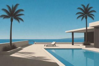
Hiroshi Nagai and Eizin Suzuki gave record sleeves a cloudless sky, a swimming pool, palm trees and a flat horizon. Vaporwave later carried this urban-resort landscape of pre-bubble longing out into the world's shared imagery.
Vaporwave


Turns memories of consumer society and early digital life into dreamlike unease.
| City Pop Illustration | Vaporwave | |
|---|---|---|
| Era | 1979–1989 / 2010s revival | 2010s |
| Family | Music Graphics | Digital Retro |
| Kind | Style | Style |
| Cues | Cloudless blue and pools / Palms and horizons / Flat airbrushed surfaces / The absence of people | Pink and purple / Classical statues / Early CG / Tropics and Japanese text |
| Best used for | Summer record or beverage campaigns picturing the city as an unpeopled ideal · Travel and hotel promotion asked for nostalgia and cleanliness at once | Handling the internet's strange homesickness · Unreality for music and art |
| Type | A thin Latin sans set small and never explaining the picture | Serifs, pixel faces, fragments of Japanese |
| Composition | A horizon drawn across the middle, dividing sky above from water below | Floating objects, horizon lines, collage |
| Material | Even airbrushed gradients and shadowless planes of saturated color | Purple and aqua, low resolution, VHS noise |
| Caution | Drawing in people or traces of daily life breaks the unpeopled stillness and drops the work to generic tropical illustration. | Don't reduce Japanese to meaningless decoration. Bring criticism or personal memory. |