Chicago Imagists vs Pop Art
シカゴ・イマジスツ / ポップアート
Both sit in Pop, so the question is not what they belong to but how they behave. They are reached for with some of the same intent, which is where they get confused.
Chicago Imagists
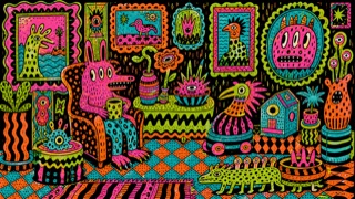
Chicago painters who compressed comics, advertising, folk art, sideshows, and ornament into distorted bodies, hard contours, acidic color, and intensely personal hand-painted image worlds.
Pop Art
.jpg)
.jpg)
Amplifies the vocabulary of ads and comics until mass culture itself becomes the picture.
| Chicago Imagists | Pop Art | |
|---|---|---|
| Era | mid-1960s–1980s | 1950s–1960s |
| Family | Pop | Pop |
| Kind | Style | Style |
| Cues | Distorted figures enclosed by hard black contour / Flat fluorescent and complementary color / Excessive mixtures of comics, signs, and ornamental frames / Symmetry or repetition sharpening the unease | Halftone dots / Bold outlines / Primary colors / Repetition |
| Best used for | Pushing comic figures past advertising friendliness into the strange and obsessive · Locking dense ornament and acidic color into one image for music, publishing, or exhibitions | Making products and campaigns pop instantly · Boldly reinterpreting familiar subjects |
| Type | Put angular hand lettering inside the frame and keep explanatory copy outside. | Comic-style extra-bold lettering |
| Composition | Enclose a central figure with ornament and small images until repetition fills the surface. | Blow up the subject; panels and repetition |
| Material | Use hard black line and enamel-like flat orange, yellow-green, and violet on a smooth support. | Red, yellow, blue, black outlines, halftones |
| Caution | A strange character alone is insufficient. Keep the obsessive handwork, Chicago artist networks, and distance from mass-produced Pop Art. | Overusing comic marks trivializes the content. Decide what you treat as mass culture. |