Breeze vs KDE Oxygen
ブリーズ / KDE Oxygen
Both sit in Platform Screen Languages, so the question is not what they belong to but how they behave. They are reached for with some of the same intent, which is where they get confused.
Breeze


The default visual style KDE introduced with Plasma 5, described in its own announcement as a high contrast, flat theme for the workspace. Graphics assets are simpler and more monochromatic, and layouts lean on typography rather than ornament so elements stay recognisable. Light and dark variants shipped as a matched pair from the beginning.
KDE Oxygen
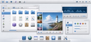
Oxygen unified KDE 4 applications, workspace and icons through clear blue, soft gray, fine outlines and icons that seem to rest on a shared shelf, bringing lightness to an information-dense desktop.
| Breeze | KDE Oxygen | |
|---|---|---|
| Era | 2014– | 2006–2014 |
| Family | Platform Screen Languages | Platform Screen Languages |
| Kind | Style | Style |
| Cues | Flat surfaces with no modelled shading, where edges are carried by contrast alone / Icons and graphic assets reduced toward monochrome, with a tight colour count / Type contrast doing the work ornament would otherwise do, so layout reads through text / The same assets existing as a matched light and dark pair | Pale-gray chrome with blue selection and restrained gloss / Dimensional icons with one-pixel edges and a lower shelf shadow / One upper-diagonal light source across materials / Toolbars and docks grouped by fine separators |
| Best used for | Making a Linux desktop application sit naturally inside the default workspace appearance · Setting the look of an admin interface that has to ship light and dark as a matched pair from day one | Giving many desktop applications one icon and chrome language · Recreating the material character of late-2000s open-source desktops |
| Type | Let type carry the hierarchy. Open a wide gap in size and weight between heading and body, and never separate them with ornament. | Keep sans labels small and clear, letting distinct icon silhouettes lead recognition. |
| Composition | Divide regions with space and thin rules rather than stacked frames or shadows. Keep the arrangement plain so visual clutter drops. | Stack menu, toolbar, work surface and status areas with fine boundaries; color only priority actions blue. |
| Material | Build on flat fields with no shading or gloss and hold the palette near monochrome. Push contrast hard, then derive light and dark from the same assets. | Build from pale gray and blue, applying one-pixel edges, a common light source and a soft lower shadow to every icon. |
| Caution | Softening the contrast breaks the premise, because a flat surface has nothing but contrast left to separate one element from the next. | Glossy blue icons alone do not make Oxygen. Synchronize lighting, edge treatment and shadow height across the entire set. |