Bento Grid vs One UI
ベントーグリッド / ワンUI
Bento Grid comes from Information Design and One UI from Platform Screen Languages. One is layout and the other style. They are reached for with some of the same intent, which is where they get confused.
Bento Grid
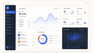
Divides different kinds of information into independent boxes, giving the whole picture at a glance.
One UI


Samsung's design language for Galaxy devices. It cuts the screen at the height a thumb reaches most easily and calls the part above that the viewing area and the part below the interaction area, so titles sit high while buttons, tabs and dialogs are gathered low. Content is collected into containers with heavily rounded corners, the ground is either white or true black, and a single blue carries every accent.
| Bento Grid | One UI | |
|---|---|---|
| Era | 2020s | 2018– |
| Family | Information Design | Platform Screen Languages |
| Kind | Layout | Style |
| Cues | Cards large and small / Aligned gutters / One-screen summary / Modules | The upper part of the screen holds nothing but a title and open space, with no touchable control in it / Text and images are collected into card shaped containers with strongly rounded corners / The title bar has only two states, expanded and collapsed, and never rests anywhere in between / In the dark theme the ground goes to true black and only the blue accent sits on top of it |
| Best used for | Presenting many features as one story · Staying friendly while keeping density | Pulling every control to the lower half of a large phone screen so one thumb can reach all of them · Rebuilding a list screen as a set of rounded containers instead of rows divided by rules |
| Type | A plain sans; oversize the numbers and short headings | Let the title fill the height of the upper area and open a wide gap between it and body text. The collapsed title may be a shorter, different string from the expanded one. |
| Composition | Tile large and small cards on four to six columns | Split the screen at thumb reach. Keep only the title and open space above, and move everything that is pressed, switched or confirmed below it. Never let the side margins fall under 24dp. |
| Material | Vary each card's role; keep decoration inside the cards | Round corners generously, roughly 12dp to 26dp. Choose one of two grounds, #fafafa or #000000, restrict the accent to a single blue, and bring no other hue onto the screen. |
| Caution | Not every card equal. Vary area and density by importance. | Putting a pressable control into the viewing area destroys the reason for splitting the screen at all, and what is left is just a layout with a lot of empty space at the top. |