BBC Global Experience Language vs GOV.UK Design System
BBC GEL / GOV.UK デザインシステム
Both sit in Platform Screen Languages, so the question is not what they belong to but how they behave. They are reached for with some of the same intent, which is where they get confused.
BBC Global Experience Language
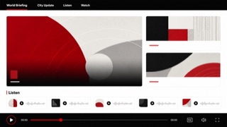
BBC's global experience language unifies news, video, audio and children's products through readable hierarchy, accessible media controls and reusable editorial components.
GOV.UK Design System
.png)
The design language the UK government's Government Digital Service publishes and maintains for public services. Everything runs in one undecorated left aligned column set in GDS Transport, and the green button keeps square corners while carrying a darker green band along its bottom edge, dropping by exactly that depth when pressed. Whatever holds keyboard focus turns yellow with a black rule under it.
| BBC Global Experience Language | GOV.UK Design System | |
|---|---|---|
| Era | 2010– | 2012– |
| Family | Platform Screen Languages | Platform Screen Languages |
| Kind | Style | Style |
| Cues | Black header over white content / Short bold headlines / News cards with consistent image ratios / Highly visible focus, captions and playback controls | One undecorated left aligned column, with almost no boxes and no shadows / A green button with square corners and a darker green band along its bottom edge, which drops by that exact depth when pressed / Whatever holds keyboard focus turns yellow with a black rule drawn beneath it / Type sizes step coarsely through 48, 36, 24, 19 and 16px with nothing in between |
| Best used for | Media sites mixing articles, audio and video · Delivering the same content across devices and assistive technology | Rebuilding a government or public service form as a single left aligned column asking one question per screen · Making the current focus position unmistakable for someone operating the service by keyboard alone |
| Type | Write short bold headlines and label content so it works without an image. | One sans serif only, in five fixed sizes with nothing in between. Headings are bold and body text sits at 19px. |
| Composition | Keep card ratios consistent but let editorial importance change their size and order. | Hold the content to a single narrow column and align every element to one left rule. No multi column layouts and no boxes, because a horizontal rule is the only break between topics. |
| Material | Use black and white as the base, with one section or programme color. | Colour is tied to meaning and never used decoratively. Buttons keep a corner radius of zero and gain their thickness from a band of their own darker shade along the bottom edge. The focus state is always yellow ground with a black underline. |
| Caution | An even card grid erases editorial judgment. Express importance through area and sequence. | Tidying the look by rounding button corners or thinning the borders on form inputs deletes the two signals this style relies on entirely, the pressable thickness and the position of focus. |