Adwaita vs elementary OS
アドワイタ / elementary OS
Both sit in Platform Screen Languages, so the question is not what they belong to but how they behave. They are reached for with some of the same intent, which is where they get confused.
Adwaita


Adwaita is the name GNOME gives its default visual style, defined in the project's Human Interface Guidelines. One set of components has to carry a light style, a dark style and a high contrast style, so colour arrives as named variables that switch rather than as fixed values. A header bar crosses the top of every window holding buttons drawn with no background and no border, and interface icons are monochrome symbolics built on a 16 by 16 pixel grid.
elementary OS
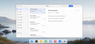
elementary OS builds a consistently beautiful, immediately understandable desktop from concise language, single-purpose windows, distinctive app icons and restrained depth.
| Adwaita | elementary OS | |
|---|---|---|
| Era | 2011– | 2011– |
| Family | Platform Screen Languages | Platform Screen Languages |
| Kind | Style | Style |
| Cues | A single header bar across the top of the window, laid out on three alignment points with the window heading in the centre / Header bar buttons carry no background and no border, leaving only the symbol and the label on the surface / Monochrome symbolic icons drawn at 16 by 16 pixels with 2 pixel strokes and no perspective / A published palette of five steps per hue, including Blue 3 at #3584e4 | A few primary actions in the top toolbar / Short copy built from concrete verbs / Multicolor app icons with distinctive silhouettes and a dark one-pixel outline / White work surfaces, pale chrome and blue suggested actions |
| Best used for | Building a Linux desktop app that has to hold the same structure in both the light and the dark setting · Adding a custom widget by riding on the existing style classes and colour variables instead of hard coding values | Small single-purpose Linux desktop applications · Desktop interfaces whose result must be clear without technical language |
| Type | Identify a control with either an icon or a label, not both. The exceptions are sidebar rows and view switchers. | Use brief everyday language and explicit verbs; never label an action merely OK. |
| Composition | Put a header bar at the top, main actions at the start, the heading in the middle, menus at the end. Always leave blank area so the bar can be dragged. Group buttons with spacing rather than by linking them. | Give one window one subject, primary actions at the top, content in the center and secondary detail on demand. |
| Material | Take colour from the published palette and hold it as variables that swap for light, dark and high contrast. Draw icons as monochrome SVG and recolour them programmatically. | Build from white and pale gray, fine shadows and blue suggested actions; give icons unique silhouettes and a dark one-pixel edge. |
| Caution | Hard coded colour values only break once someone switches to the dark or high contrast style, which is exactly the state the author never looks at. | macOS-like wallpaper and rounded icons miss the point. The concise writing and one-window-one-purpose model must travel with the look. |